
.png)
The Short Answer: A landing page is often a potential customer’s first impression of your business. Landing page design shapes how quickly visitors understand what you offer, how much they trust your brand, and whether they take the next step.
A well-built landing page supports a better user experience, helps guide visitors toward a specific action, and gives your SEO, paid media, and email marketing campaigns a stronger path to higher conversions. At 20North, we combine strategic landing page content, thoughtful visual elements, and data-backed page optimization to help growing businesses turn website visitors into leads and customers.
What Makes an Effective Landing Page?
A landing page is a dedicated web page built around one campaign, audience, offer, or conversion goal. While a standard website page has broad navigation and multiple paths, an effective landing page gives the visitor a focused route toward a clear action.
That action may be requesting a quote, booking a consultation, downloading a resource, starting a free trial, making a purchase, or submitting contact information. The best practice is to make the desired action obvious from the moment someone lands on the page.
A high-converting landing page aligns four things:
- The traffic source and message.
- The target audience’s needs and expectations.
- A clear value proposition.
- One primary action for the visitor to take.
Start With a Clear Focus
Landing pages are more effective when they are concise, thoughtful, and have a clear goal in mind. Before choosing a color scheme or adding visual elements, define the purpose of the page.
Ask these questions before building your page layout:
- What action do we want visitors to take?
- Who is the target audience?
- What problem does the offer solve?
- What makes this offer different from alternatives?
- What information does a visitor need before taking action?
A benefit-driven headline should quickly communicate the outcome a visitor can expect. Support it with a short explanation, relevant visuals, and a clear CTA button that reinforces the next step.
Generic messaging creates uncertainty. Pages built for a specific audience, campaign, or service tend to create a more relevant experience for potential customers. For example, a landing page for e-commerce SEO should speak to online store growth goals, while a page for local service businesses should focus on qualified leads, phone calls, and booked appointments.
Design for Your Target Audience
Great landing page design begins with audience research. A page for a first-time shopper needs different landing page content than a page for a B2B decision-maker comparing service providers.
Consider the visitor’s awareness level, goals, objections, and source of traffic. Someone arriving through social media may need a quick, visually engaging introduction. A visitor searching Google for a service may be closer to taking action and may respond better to proof, process details, customer testimonials, and contact information.
Your messaging should match the ad, email, search result, or social media post that brought the visitor to the web page. This message match reassures people they have landed in the right place and keeps visitors’ attention focused on the offer.
A strong value proposition answers three questions quickly:
- What do you offer?
- Why does it matter to the visitor?
- Why should they choose your business?
Build a Clear Visual Hierarchy
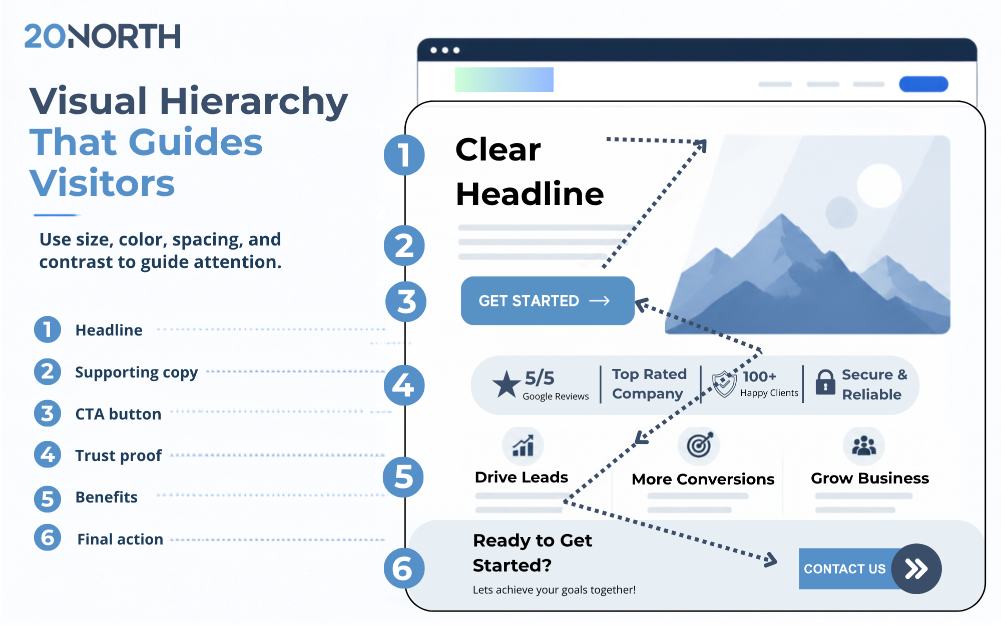
Visual hierarchy is the arrangement of page elements based on their importance. It helps visitors understand content quickly and guides them toward the action you want them to take.
Use size, contrast, spacing, color, type, and placement to create a clean layout. Important information should appear before supporting details, while the primary CTA button should stand out without competing against multiple calls to action.
A simple hierarchy often follows this order:
- Compelling headline and value proposition.
- Supporting landing page copy.
- Primary CTA button.
- Social proof and trust signals.
- Benefits, features, and process details.
- Final call to action and contact information.
Use plenty of white space to help visitors scan the page. White space is not wasted space when it gives text, visuals, and calls to action room to breathe. A crowded page can make it harder for users to identify the offer and find the next step.
Use F and Z Patterns
Every landing page should have an intentional visual flow. Eye-tracking research commonly identifies F-pattern and Z-pattern scanning behavior, which can help guide visitors through a page.
The F pattern often works well for content-heavy pages. Visitors tend to scan across the top of the page, move down the left side, and read shorter horizontal sections as they continue.
The Z pattern works well for short, conversion-focused pages. Visitors commonly scan from the top left to the top right, move diagonally down the page, and finish toward the lower right. Place directional cues, a compelling headline, and a primary CTA button along this path to guide attention.
Keep the Landing Page Clean & Focused
The landing page should be easy to scan and centered on the visitor’s needs. Long paragraphs, vague language, and too many competing messages can pull attention away from the conversion goal.
Use clear headings, short paragraphs, bullet points, and descriptive subheads to organize information. Each section should answer a question, overcome an objection, or explain a benefit.
A useful landing page framework includes:
- A compelling headline that states the primary benefit.
- A supporting statement that explains the offer.
- Benefit-focused bullets that clarify value.
- Social proof such as customer testimonials, reviews, credentials, or case study results.
- A direct call to action.
- Contact information, including a phone number, when a conversation is likely to help convert leads.
Keep your page specific. “Grow your business” is broad, while “Turn more paid clicks into qualified leads with conversion-focused landing page design” gives the visitor a clearer reason to act.
Use Relevant Visuals and Consistent Branding
Engaging visuals can improve the user experience and make an offer easier to understand. Product imagery, team photography, short videos, process graphics, and feature callouts can all support conversion when they are relevant to the message.
Every visual should have a purpose. It can demonstrate the product, reinforce a benefit, establish an emotional connection, or direct attention toward an important CTA button. Avoid generic stock imagery that does not add context or credibility.
Consistency also matters. Your landing page should reflect the same brand identity visitors see across your website, ads, email campaigns, and social media. Use a consistent color scheme, type treatment, photography style, and brand voice to create a familiar experience.
Design choices should support accessibility as well. Use readable text, adequate color contrast, descriptive image alt text, and buttons that are easy to identify and use. A clean layout helps more people engage with your content across devices.
Make Mobile Performance a Priority
Many website visitors will see your landing page on a phone first. Your page layout should adapt cleanly to smaller screens, with readable copy, thumb-friendly CTA buttons, fast-loading images, and forms that are easy to complete.
Page speed also affects user experience and SEO performance marketing. Google’s guidance for Largest Contentful Paint, a Core Web Vitals metric that reflects when the largest visible content appears, recommends an LCP of 2.5 seconds or less for at least 75% of page visits.
Review your landing page performance in Google Analytics and Google Search Console. Monitor page load time, engagement, form submissions, bounce behavior, and conversion rate by device. A one-second delay can create friction at the exact moment a visitor is deciding to convert, so optimize large images, remove unnecessary scripts, and prioritize above-the-fold content.
Build Trust Before Asking for Action
Trust signals help reduce uncertainty for potential customers. They can be particularly helpful on service pages, high-consideration purchases, and lead-generation landing pages.
Add proof that supports your claims without distracting from the primary goal:
- Customer testimonials with names, roles, or business details.
- Reviews and ratings.
- Client logos or partner badges.
- Relevant case study outcomes.
- Awards, certifications, and industry experience.
- Clear privacy language near lead forms.
- Visible contact information and a phone number.
Social proof works best when it appears near a decision point. A short customer testimonial positioned beside a form can reassure a visitor before they submit their contact information.
Test, Measure, and Improve
Landing page design is not a one-time project. The strongest, highest-converting pages improve regularly through analysis, B testing, and iteration.
A/B testing compares one controlled change at a time, such as a headline, offer, image, form length, page layout, or CTA button. Test a clear hypothesis, collect enough data to reach statistical significance, and evaluate results against the conversion goal.
Helpful experiments include:
- Testing a benefit-driven headline against a feature-focused headline.
- Comparing a short form against a longer qualification form.
- Trying different CTA button text.
- Moving customer testimonials closer to the primary CTA.
- Testing relevant visuals against product screenshots or video.
- Comparing a long-form landing page with a shorter page layout.
- Testing navigation-free pages against pages with limited navigation.
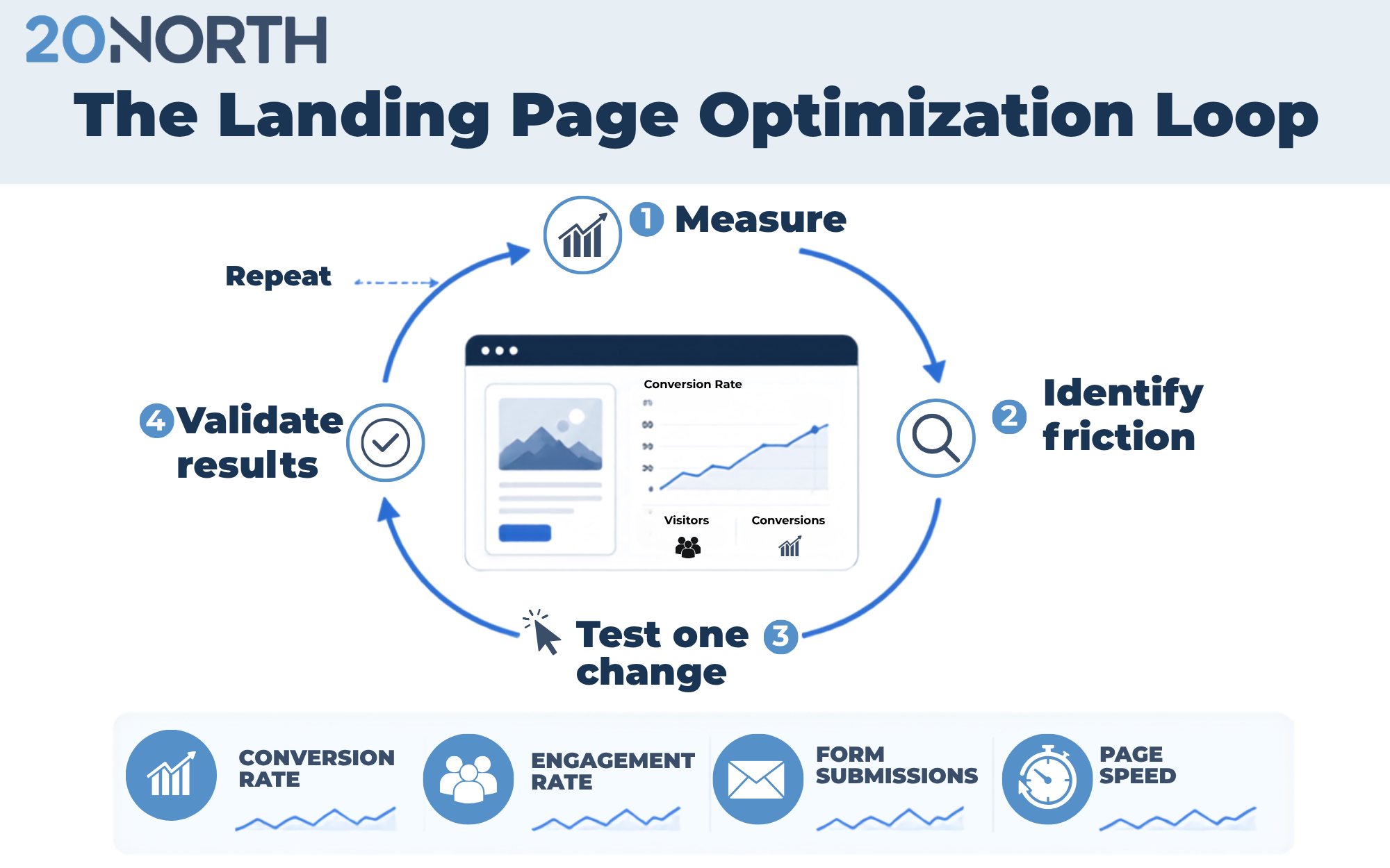
Use data to guide changes. A CRO audit can identify friction points through analytics, session recordings, heatmaps, user behavior analysis, and conversion funnel review.
Inspiring Landing Page Ideas
The following brands offer useful examples of landing page design principles in action. These are not templates to copy. Instead, use them as references for clarity, value communication, trust, and focused page experience.
Wix

Wix uses a clear CTA and a simple description of its business. The page presents engaging visuals that encourage visitors to explore more while keeping the primary message easy to understand.
Zillow

Zillow makes its core task intuitive. Visitors can quickly search listings, view organized value propositions, and move toward the information they need without unnecessary complexity.
Codecademy

Codecademy speaks to different audience needs and makes it clear how users can get started. The visible CTA above the fold and consistent branding support an approachable experience.
Curology

Curology uses consistent branding, a clear value proposition, and a personalized interactive header. This creates a stronger emotional connection while helping visitors understand the next step.
Harry’s


Harry’s demonstrates the impact of white space, minimal navigation, an upfront value proposition, and a visible CTA. The page keeps focus on the product and reduces distractions.
Abercrombie

Abercrombie uses clean design, product-led imagery, and a clear brand identity to draw visitors’ attention toward its fashion offerings.
Gusto!


Gusto uses color, size, and spacing to create a strong visual hierarchy. The page blends recognizable branding, appealing imagery, and white space to guide the visitor through the experience.
Improve Your Landing Page Performance
A great landing page combines clear messaging, focused design, relevant visuals, credible social proof, and ongoing testing. It should make it easy for visitors to understand the offer, trust the business, and take the next step.
20North helps growing businesses create high-converting pages through SEO, AEO, paid media, and email marketing. With our web development and conversion rate optimization services, we provide landing page design, user experience, analytics, and testing to turn website visitors into qualified leads. Reach out to our team to get started today!
.png)
.png)
.png)